Here are my top 10 prints of 2013. Not all will be Mondo releases but a lot will. Also no particular order unless stated. Ok There Will be Blood Variant might be my favorite.

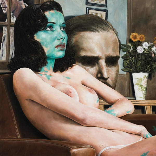
I think this Mark Lone piece might be underrated. It looks amazing in person and is illustrated beautifully.
Artist: Mark Lone
Size: 36”x24”
Printed by: THE HALF AND HALF
Details: 10 colors and 3 metallic inks
Run size: 140

Being a huge Star Wars fan as soon as I saw this at Spoke Arts both at ArtPadSF I had to have it. The Original sold for $2200
Artist: Scott Scheidly
Size: 11" x 14" (unframed) - 14" x 17" (framed)
Printed by: N?A
Details: Fine art giclee print in a custom painted hot pink frame
Run size: 50

I was lucky enough to attend this show that featured Ken Taylor and Tyler Stout at the Mondo gallery in April of 2013. When I finally got inside the gallery after many hours of wait this piece with one of Stouts (made the list) were the ones I was really excited about. The metallic look amazing in person and the detail is spot on.
Artist: Ken Taylor
Size: 15”x36”
Printed by:
Details:
Run size: 205 (Variant)

As mention above I went to the Tyler Stout/Ken taylor Mondo gallery opening. When I was inside and turned the corner to see this in person I fell in love with it. In my opinion one of Stout best and most underrated prints. The colors are spot on, I love the glow in the dark teeth and the composition is great! If you haven't seen this movie do so, then buy this print!
Artist: Tyler Stout
Size: 36”x24”
Printed by: D&L Screenprinting c
Details: 7 Color Screenprint with glow inks/
Run size: 290

This is the only print I do not own in this list ( I do own the Regular version Variant shown). When I first saw this print I thought "That is insane!" I thought the 2 dollar bill (Thats what I call it, probaly no one else) was one of the best posters I have seen in a long time. Horkey has fast risen to the top of my favorite artist. His Pan's Labyrinth, Lord of the rings prints (scored a Two Towers) Dead man are some of the best detailed prints out there. I will own this one day, oh yes it will be mine!
Artist: Aaron Horkey
Size: 18.25”x39”
Printed by:
Details:
Run size: 200

This Taxi Driver poster was Mondo screening exclusive in Austin Texas. A friend and I bought two tickets to this but had no clue how to get out to Austin in time. I had a friend that lived there and we asked if he would go in our place and send us the posters. All it took was the promise of some beers during the movie and we were set. This is definitely one of those posters that look a lot better in person ( I say that a lot). Glad I was lucky to have a good friend get it for me.
Artist: Martin Ansin
Size: 36”x24”
Printed by:
Details:
Run size: 405
For me personally, 50's movie posters like a lot of Reynold Brown's work are what got me into movie posters. Larger than life characters and crazy monsters. Francesco nailed it 100% here! Francesco in my book has some of the best titles and lettering in this group. The color way is amazing and the yellow titles feels like a throwback to the 1950's movie posters. I love this print!
Artist: Francesco Francavila
Size: 36”x24”
Printed by:
Details: 13 colors
Run size: 325

I might be cheating but Im grouping these as one since I think they compliment each other. I didn't get to go to the gallery show for this series but I wish I could have. Amazing detail and who doesn't love the Universal Monsters and Bela Lugosi!
Artist: Jason Edmiston
Size: 18”x24” each
Printed by:
Details:
Run size: 175 each

Here is a poster I will always regret passing on and not making an attempt to get. I always wanted an awesome Jaws poster and for some reason when this came up I wasn't crazy about it. I thought it was good but figured I would pass and maybe make a good trade for it later. Man do I regret that decision. the more I look at this print the more I like it. This captures the travel poster in a perfect way. It has the feel of a Roger Broders' travel print but Durieux's style still comes through. Another poster I will have in the future! Durieux is having a gallery show at Mondo February 7th 2014. I can almost bet that the Forbidden Planet print will be on my 2014 list. Im also hoping that the Back to the Future one will be as well.
Artist: Laurent Durieux
Size: 36”x24”
Printed by:
Details:
Run size: 525
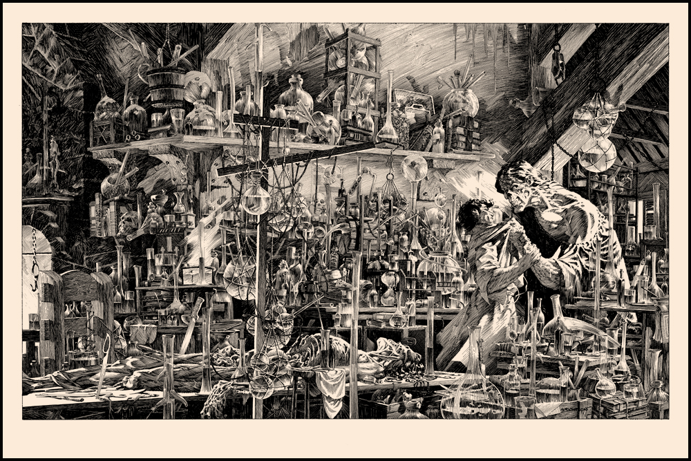
Tim Doyle released a 9 run series of Bernie Wrightson Frankenstein prints. I subscribed to the series and received all of the and they do not disappoint! The fine detail in some of these prints are on a whole other level! The exclusive print Perished on the Scaffold is chilling.
Artist: Bernie Wrightson
Size: 36”x24”
Printed by:
Details: 130lb Cougar Natural Cover
Run size: 200